Sunday, 19 October 2014

LES BLEUS DE RAMVILLE

The television series, Les Bleus de Ramville, is a Canadian programme, about the fans of a local hockey club team. This show also won an awards for its opening sequence and I am going to analyse the use of the different camera angles and techniques so that I am able to include these techniques in my own opening sequence.


The opening shot constraints the frame, making the eye focus on the hockey player's pre-match preparations. The mid-shot from inside the locker starts off as a dark black background, however when the player removes his t-shirt the shot manages to give the viewer a sensation of freedom, as the dark environment turns into a bright one as we are able to see colour and lighting. By using this mid-shot we as an audience are able to feel his nervousness and power of this player as he prepares to go onto the ice and fight to win the match. I think that this shot would be a very useful one to duplicate as it would be a very influential opening. 

Here, we can see a low-angle, close up shot of someones  foot as they are going up the stairs to get to their seat. This shot makes the viewer feel closer to the characters and their deep emotions. There are also sparkles of light that appear quiet frequently, this creates a sensation of hope and where there is darker lighting it suggests that this hope is cut off. This therefore builds up the mounting tension as the game is about to start and people are taking their seats to watch the match. I will try and include the use of the close up shot as it adds tension in the opening sequence. 

In this scene there is a use of a tracking shot and as the camera moves across we see a helmet and and title credits appear. The camera slowly moves from left to right in order to let the audience see the mask.  Also the contrast of colours work very effectively together as the theme is black and white, where the white credits are made very legible as the background is black, and therefore making the credits stand out more boldly. The white credits also ties in with the white helmet, therefore connecting the two together. I would like to use this tracking shot as it is simple yet very effective and it easily builds up the tension for the opening of the film. I also want to make sure that the credits are legible and are well placed.

In this tilt-pan shot we see bright lights that shows the time ticking down. As the camera moves down the scoreboard we see that the number changes from 14 to 13 and the background music ties in with this shot perfectly as we can hear the sound of a ticking clock aswell. Therefore the countdown and the ticking sound in the music match up together perfectly, making this shot a very powerful one. 

Here, we see a mid-shot of a man's face and the mis-en-scene shows split beer and popcorn flying about in the air. The prop of the liquid is used in such a way that allows us to see the rush of excitement and thrilling sensation that goes through his body as a player scores a goal. The expression of his face also shows the audience the joy and exultation that he feels in that moment. The use of the slow motion allows us to absorb the atmosphere more, created by the people watching the match. I would like to include this in my opening sequence as it gives the audience a feel for the atmosphere they find themselves in.

Another shot that they've used here is an over the shoulder shot. This contributes to the wide variety used in their opening sequence. Again, the credits are placed in an appropriate place, as it doesn't overcrowd the shot or distract the viewers attention. In this shot we see a row of men marching onto the ice, this creates a sense of formidability as the team players are almost seen as warriors and fighters, ready to beat their enemy, this also creates tension as they're presented as intimidating and daunting. I would like to use an over-the-shoulder shot as it can be very effective in many different ways.

The music soundtrack in this opening sequence is simple and elegant and therefore it changes the typical stereotype of hockey as the music is normally more hectic, loud,violent, frantic and faster. I like the different action shots that take place in this sequence such as; people playing hockey, calendars, masks and the scoreboard. All of this imagery works well together as it helps create the atmosphere of being a fan and a hockey player and also it is all associated with the same thing, hockey.

Friday, 17 October 2014

DISTRIBUTION: PRIDE

I am investigating how the distributors attract and address the target audience for this film. 
In order to create a big audience you have to get your film noticed and one of the ways this film was able to get a large audience was by firstly making a video soundbite from actor Andrew Scott urging audiences to book tickets 'as there is only one week left.' This sound bite was near the top of the website, therefore catching the audiences attention. This will also really persuade people to go and see the film, especially if they like Andrew as a person and his work. 
Also, 'The real LGSM and stars of #PRIDE marched with a live band to Odeon Cinema, Camden on Tuesday 2nd September for the Premiere! This too would have helped gained audiences as many people would have like to feel apart of this. 

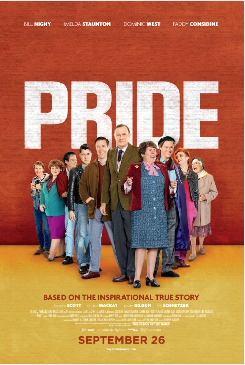
Furthermore, the poster would attract a large audience because of, mainly, the choice of colours. The bright yellow and red makes the poster really stand out from other film posters as they aren't dark colours. The title of the film, "PRIDE", is big, bold, capitalised and white and therefore stands out as there is a red background, making the white colour seem more clear and noticeable to see. We then have a group of more elderly people who we see in this poster and because of there bright coloured clothing and happy faces we assume that this film is a joyful and positive one. 

Also, media such as twitter was used in order to spread the word about this film. By creating a twitter page on the film Pride many more people will become aware of this film and they might even pass on a trailer of the film by retweeting it. This is called a second knock on effect, where it takes two stages in order for someone to hear about this movie and this can be very effective when trying to get the film out there for the public to see and hear about. 


As well as this, they have also created their own website, which follows the colour scheme of red and yellow. By adding a website they are able to attract more of a larger audience. They also have the use of many pictures of the actors that feature in this film and snippets of the film by using pictures and GIF. 

Moreover, the #PRIDE sign is also able to generate a large audience as this is very popular nowadays, it can also be considered a new form of advertisement as it is an easy way to spread the word about the film. 

Thursday, 16 October 2014

UPDATE/NEW TRELLO LIST

I have updated my Trello list since last time, showing that i have completed all of my tasks that i needed doing.


I have already made a new list as i have a lot to keep on top of.
Look below to see my new board list.


Sunday, 12 October 2014

UPDATE OF TRELLO

Here is the update for my recent Trello list, as you can see, I have researched and posted the film for "Nowhere Boy" and I'm still in progress of completing the 3 blogs for Art Of The Title

Friday, 10 October 2014

RESEARCH; THE ART OF THE TITLE

Iron Man 3
I also looked at the opening of Iron Man 3. In this opening title there are lots of interlocking angled transitions and perfectly timed-freeze frames bring the Marvel cinematic universe every so briefly back to the pages and panels that first spawned it. By using the interlocking angled transitions they are able to show off how much action there is in the film. It also shows us that this is a contemporary modern film. The picture below emphasises my point as there is a lot of advanced technology in this film that barely even exists. 

The dark black and red backgrounds emphasises the big, capitalised golden-yellow colour at the front to show the opening credits. Moreover, they have timed and positioned the credits in a suitable place, for example, below we see a big costume that a man is wearing and in front we see who the costume designer is. 


Again, in this opening film we see a lot of red, representing danger and possibly blood, therefore suggesting that there is a lot of action and adventure in this film.

Thursday, 9 October 2014

NEW TRELLO LIST

I have made another Trello list in order to keep ontop of my work and clearly set out what i need to do


RESEARCH; THE ART OF THE TITLE

Mrs. Doubtfire

Another film that i looked at is Mrs. Doubtfire, set in 1993. From looking at the picture above we are able to recognise that it is an old fashion film and the genre is a family comedy. In these pictures there is a lot of mis-en-scene. Such as a high street, cars, animals and people. The mis-en-sene, light music and different colours create a sense of community in the film. The credits are of a light yellow colour, suggesting a light-hearted funny film.

The picture below shows a family, who are all happy. Again, there is a lot of mis-en-scene and bright colours, creating a light mood and happiness, therefore drawing in the audience to watch it as everybody loves a happy and joyful film.

RESEARCH: NOWHERE BOY


At the beginning of the film we see a grand big stone building. The use of shot on this building is an establishing shot. They have used this shot as it is the first shot of a new scene and so by using this shot we, as an audience, are ably to see where the action is taking place. After this we then see a young boy ( John Lennon) running through the building. With the use of a tracking shot, we are able to see his disregard and ignorance towards this historical building. 


As the film progresses we are able to see that he and his uncle has a close relationship towards one another. An example of this is when the boy and his uncle are bonding over the harmonica, however they are aware of his aunt mimi's presence. This shows us that they both have a close bond together and that he and his aunt don't perhaps get on well together. 

Aunt Mimi is presented as rather a dull and boring and strict person as she wears dark black clothing, never laughs and orders out instructions to the young boy. for example, when john is about to go off to school aunt mimi yells at him to put him glasses on. However, as soon as he is out of site, John takes off his glasses, showing us his disregard towards her rules. The happy music played in the background, as John is cycling to school, suggests to us that he is a fun, charismatic character. 

Further through the film, John's uncle dies, leaving him alone with his aunt. When he's told about his uncle's death he leans against the door frame for support as he is in shock and doesn't feel stable enough to stand on his own two feet. However, aunt Mimi, instead of coming over to the boy and giving him a hug, turns away from him so that she John isn't able to see any of her emotions and how upset she really is. There is little mis-en-scene in the next scene as the lighting is set to be a very dark, gloomy and cold atmosphere as there is very dull lighting, this emphasises that it is a sad, emotional and depressing time for John as he has not only lost an uncle, but also a friend.The camera angle shown when John hugs his aunt from behind shows that the two of them are very different and it also shows the contrast in their emotions. 

Wednesday, 8 October 2014

iSTOP MOTION

I have created a NewHive, explaining what I did in yesterdays lesson. By creating a NewHive, the viewers will find it visually attractive to read and look at. Look below to see more NewHive, or click HERE to view it online


Friday, 3 October 2014

RESEARCH; THE ART OF THE TITLE

Skyfall

Today I started to research opening title sequences in more detail. I was able to do this by using the helpful website, the art of the title. For my first film I chose the well know film skyfall

The slightly strange pictures that we see (such as a man sinking into the ocean by sand) is confusing for the audience, however at the same time it draws in and invites the viewer to be intrigued by this. As Bond is sinking into the sand there is a use of a high angle shot to show the audience where bond is heading, and it looks like a plug hole in the seabed that is swallowing everything that is near it. This makes the audience wonder why he has been pulled down and where he is going. 
 
This film is set in the current time period and we know this because of the more mordern text font and the wider use of different colours, such as blue, red, yellow and black, as to opposed of the brown and black dull, old fashion colours. In these still scene pictures we notice that the same man is presented, this suggests that he is the main character in this movie and that he is going to be quiet significant to the film, therefore the audiance pay particular attention to this man as we know he will play a vital role in the film.

At the beginning of the production, we see a low angle shot of the protagonist, seeming to be lifeless in the water. this gives the audience an enigma code as they wonder whether he's alive or not. As he is losing more control of his body in the water, the camera pans to a high angle shot to make him look vulnerable and then it dissolves to a black screen which makes it mysterious as the audience are left to wonder what's to happen next. All of a sudden we see a woman's hand grab him from his arm, trying to drag him deeper into the water. So this tells the audience that she is an antagonist and is trying to kill him. The hand that is dragging down fades to an extreme long shot where the hands is made to look twice as big as Bond's height. The use of this shot makes the hand look very dominant and controlling, as she is effortlessly making him fall deeper into the water.


There is a lot of use of red in the opening of this film, and the splattered red colour suggests that danger is close by. Furthermore, the blood ( from red colour) is pinpointed in the main characters chest, suggesting that he may be close to death or that he is a target and is wanted dead. This could be foreshadowing to what could happen in the near future. There is also use of blood colour which is set in a grave yard, suggesting more death in the film. Also, there is the use of the colour yellow, representing flames and fire. The fire, again, is coming from the main character, suggesting the danger he is in. From all of this we are able to classify this film as an action movie, with lots of danger in it.

During this opening in the film there is a scene where the camera pans up to show many reflections of Bond through mirrors, we then see him shooting all of the mirrors that shows him. This connotes to the audience that he might be in conflict with himself in the narrative, he is also seen to be bleeding in this shot.

The text used is also very consistant and it is all the same size, apart from the title, where the size is bigger, this signifies the importance of the title.

There are a variety of camera movements in this opening film, such as zooming in, pan and tracking

The lighting plays a significant role in the opening. the darkness creates a sence of mystery and a darkening tone to the film

UPDATE OF TRELLO

Here is an update on my trello list, showing my progression


Thursday, 2 October 2014

REPRESENTATION

In this image we see a young, black, french boy who is saluting to probably the french flag (the tricolour). To make a myth, the sign itself is used as a signifier, and a new meaning is added. The signifier in this picture is the young black soldier. But it has been chosen by the magazine to symbolise more than the young man; the picture, in combination with the signifieds of Frenchness, militariness, and relative ethnic difference, gives us a message about France and its citizens. The picture  demonstrates that the combination of the signifier and signified perpetuates the myth of imperial devotion, success and thus; a property of 'significance' for the picture. From this poster a story/myth is constructed as we look deeper into it, this is semiotics. 


This image shows a bag containing, mainly, bags of pasta, with some fruit overflowing from the sack. He turns to a particular advertising image, one in which a mesh grocery bag lies on the table; its contents: beautiful, fresh vegetables and a box of pasta displaying a brand name. This image is designed to incite us to buy the pasta and it attempts to do this by signifying on several levels information that will provoke desire. Barthes proceeds by breaking this system of signification into three parts, that of the linguistic message, the coded iconic message, and the noncoded iconic message. For the linguistic message you need cultural knowledge to decode the text. The picture it self is advertising the brand of pasta, Panzani. The coded message shows us an open bag, signifying freshness and domestic preparation. 


Choose a photo from a recent film and analyse the representations depicted. 

In this picture (from the film Jack Reacher) there is a lot of mis-en-scene, such as street and shop lights, roads, cars, darkness and people. Clearly, from this picture we are able to see that the person in the middle is being surrounded by 5 other men who seem to be picking a fight on him. From the mans stance we assume that he is quiet capable of fighting his own battles and he doesn't seem to show any vulnerability or fear, suggesting that he has been trained to fight in battles before and we assume from this that he is perhaps a military/ army man who has many skills. 


Wednesday, 1 October 2014

SET UP OF TRELLO

Today i made a Trello account, allowing me to make a list of what i need to do, what i am doing and what i have done. This is an effective way to help me keep onto of my work load. i will be posting screenshots of my Trello account regularly to show my progress.

This is the first screenshot for my first list on Trello.


ISTOP MOTION

In todays lesson Agatha, Kate and I made progress on our iStop Motion. We mainly focused on cutting out each rainbow and all the letters. This took up most of the lesson as we had to make sure the cutting was carefully done and was not rushed. I have made a photo collage below to show what we did during the lesson.